Ravencrest
Problem Statement:
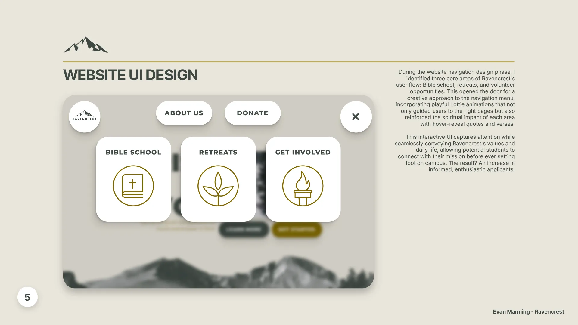
Ravencrest struggled with prospective students enrolling without a clear understanding of its mission, values, and offerings, leading to mismatched expectations and lower retention rates. By refining the application process, we successfully created a clearer, more engaging way to connect students with Ravencrest’s mission from the start.

UI Design
During the website navigation design phase, I identified three core areas of Ravencrest's user flow: Bible school, retreats, and volunteer opportunities. This opened the door for a creative approach to the navigation menu, incorporating playful Lottie animations that not only guided users to the right pages but also reinforced the spiritual impact of each area with hover-reveal quotes and verses.
This interactive UI captures attention while seamlessly conveying Ravencrest's values and daily life, allowing potential students to connect with their mission before ever setting foot on campus. The result? An increase in informed, enthusiastic applicants.
Brand Guidelines
When developing Ravencrest’s brand guidelines, I aimed to create a visual identity that genuinely reflects who they are. I chose a desaturated forest green as the primary color—symbolizing deep relationships and the steady growth students experience there.
This rich, muted green echoes the peaceful, reflective atmosphere of their campus, where personal and spiritual maturity are central to their mission. To complement it, I added a secondary warm gold, representing the divine light and wisdom of Christ that guide their community.


Logo Design
When designing the Ravencrest logo, the goal was to create a symbol that felt meaningful to the community and reflected the school’s local heritage. Longs Peak, a defining feature of the surrounding landscape, became the centerpiece - its towering presence representing the challenges and growth students experience during their time at Ravencrest.
For the typeface, Univers was chosen for its clean, modern feel, balancing the timeless strength of the mountain with a sense of clarity and adaptability. The result is a logo that stays true to Ravencrest’s roots while looking ahead, capturing both its founding mission and the journey that its students are on.
Conclusion:
In short, making sure prospective students understand Ravencrest’s mission before they enroll is key to building a connected and engaged student body. By improving their visual identity, using interactive UI elements, and creating clear brand guidelines, they can better communicate what makes Ravencrest unique. Ultimately, it’s about creating a community where students can grow in their faith and make the most of their time at Ravencrest.